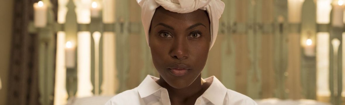
The final product:
Class/Peer Feedback for the production ‘Off The Beaten Track’


One comment recieved was that there could have been more dialogue to present the story more, but contradicted themselves when they said the character’s emotions were reflected in the cinematography.
Evaluation
For Unit Eight the task was to produce an adventure film using the Peak District. The film was picked to be made by a class decision. This video was directed, filmed, mixed and edited to be what it is now. ‘Off The Beaten Track’ is a film about depression and its side effects.
The film ‘Off The Beaten Track’ has excellent cinematography. Overall the shots that were taken were really good, they had amazing cinematography and scenic views. They all were exposed to the best quality and were all proper shot sizes. One example is the extreme close-up of Max’s eyes.
Madison’s shots were really highly thought of in the class feedback, although there we obviously a few faults in some of them. The first shot, the slider shot, was unbelivably wobbly because the slider was being blown by the wind, making it look unprofessional and not thought well of. The colour grading was overall good, except that hardly any of the shot we colour graded the same. They don’t look the same when put together in comparison, but individually they looked good.


As you can see from these two examples above, there’s a massive dfference betwen the two shots and they are the same, just different sizes. To overcome this I think the cinematographer should have looked at the settings for both shots, compared them and adjusted them apropraiately as the more zoomed in shot has warmer tones than the one on the left. The left shot is what I wanted but somehow the right shot didn’t turn out the same. Some handheld footage could have been better, for example when Max leaves the tent and when Max is walking towards the other two characters. The shot of Max with the two other characters show the shadows/blacks been turned up to full effects. Max’s hair looks funny and Alex’s colour of his coat is over-exaggerated. The gimble could have been used for this instead of freehand which could have minimised the shakiness of the footage. The interior shots were more successful. The lighting (as it was artificial) could be manipulated to fit the correct look of the film. The colour grading process for maddie was easy as all she really had to do was turn the highlights down. the comparison between the before and after shots were really obvious. The camera based feedback was positive with many claiming the ‘aesthetic’ of the film was matched through the cinematography. Overall there was some vital critical views which dictated themselves; one person said the shot were well exposed but another said they were over-exposed to which is rather confusing as when putting the video together and working on the colour grading, were there never any problems with shots being over-exposed.
The sound work was a uncertain aspect in the film. Overall the sound was good, it had all it needed to make sense, to understand what was being said and what was being done in the film. Though this, the settings with the volume seemed like a problem. The bleep noise to represent the character falling asleep, was way too loud, unbelievebly loud. It should had been turned down and this was a consistant, reoccuring comment through peer assessment too. The speech at the end just didn’t work. It all synced up perfectly but the enviroment of which it was film doesn’t match the one on set. It sounds too echoed, too enclosed room like instead of being natural and environmental. I sounds blunt. Using effects in Adobe Audition, the sound could have been changed to sound more natural and not sharp. The volume of this speech is also very quiet, it’s a shame that it was as the matching speech to visuals through using foley was very good. The speech, because so artificial, ruined the feel of the film. Next time to improve, there should be more use of effects in Adobe Audition to make the auidence feel a sense of realism, there should also be more focus and attention to volume levels in the film, because the volume can really make or break a film. The feeback from peers shows us the severity of the sound: ‘The sound baffled me’; ‘dialouge should be louder’ and ‘dialouge didn’t match the location’ all shows how much of the sound was noticable to not just people in the group but to all the audience.
The editing for ‘Off The Beaten Track’ is a strong point in the production. Nothing for the editing was suposed to be unbelievably complicated. Hard cuts with continuity. This was acheived by the editor but little contininuity fails could be spotted when being overly picky. In the shot where Alex and Rainbow are calling Max over and by the time he reaches there, Alex has his hood up. This is not particularly the editor’s fault in editing as they were not the one to be put in the position of checking that all the shots were the ame onset. But, this reflects negatively on them as it’s an obvious mistake in production. The editing was praised by the peers. ‘Top notch’, ‘the editing was good from cutting inside the tent to outside’ and ‘the editing fit’. The titles were basic, they fit the film, and were highly thought of. But with the titles the font could be a bolder font as to show the heaviness of depression within the film to make it look more dreary at the start.


The direction in the video shows strong ideas. The basis of the storyline was well thought out and so the audience thought so too. The directon is reflected in the film by the expression on the actor’s face. The actor hasn’t observed for himself that he has to look down and sad, he has been informed of it and been expected to apply himself to show that specific emotion. In all shots Max had applied himself. The extreme close-ups show Max crying, in the tent his expression is mostly confusion and happiness, when leaving the tent it’s relief. All to which are easy to spot. The feedback from peers discuss his emotions saying that ‘Max’s acting is great’ and ‘good concept towards emotions’. Most shots suit the film, for example when Max has met the two other characters and says his line, with all focus on him, it is a medium close up.
One shot I would be willing to change is the shot of the props.

This is because of the angle. The correlation between the props don’t work and the bird’s eye view of the diary doesn’t appease me and would be thouroughly willing to re-shoot it. The director should have spotted this shot eariler upon onset review and realised the unsatisfaction of this shot. The feel of the film could have been more so according to one peer comment ‘the message of the story didn’t come through’, but somehow has been contradicted by someone else’s comment ‘the concept of the film was good’, ‘the story was clear’ and ‘ I loved the concept’. I can see how someone may believe that the story was unclear due to the lack of titles and lack of speech to direct them in the right direction. Perhaps to make sure it is clear for everyone, maybe add in a line or two in the video about what the film represents, or even choose a title that is more relevant to the storyline and people will instantly recognise what the film is about.
The production values are especially recognised in the film production due to them all being an effect of the main concept in the film. The cigarettes showed the lasting effects, a habit that some people have even though it destroys their health. I think if the cigarettes were lit and looked like they had been used, the realism of the reality would become more apparant to the audience. The alcohol bottles and the diary represented the duration of the characters time stuck in depression as an alcohol problem takes up a lot of time and abuse. The diary marks out the length of time the character has been in that state of mind. Therefore, these props were really useful in the film to get the message of the film across as they are easily recognised. There was no specific feedback for the prop shots but the interior shot were said to be ‘good’. To represent depression better I don’t there could be a better way to apply isolation in the Peak District without the use of a tent to explain the characters emotions. The use of the tents allowed the audience to understand the concept and gave out explicit representations.
